
 By TechOriginHub Editorial Team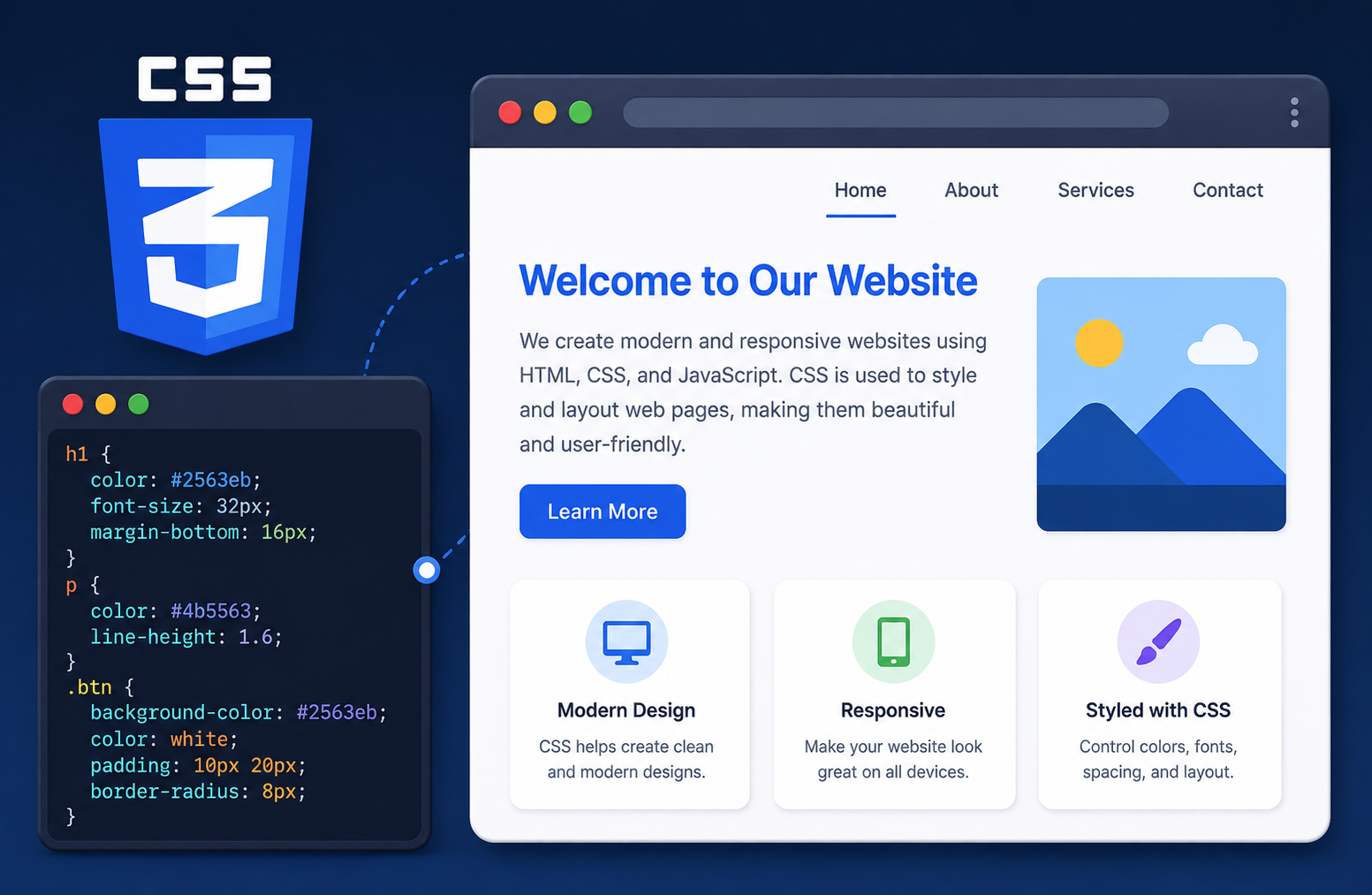
Introduction
Have you ever wondered why two websites built with the same basic text content can look completely different? One might have elegant typography, a carefully chosen color palette, and a clean responsive layout that adapts beautifully to your phone screen. Another might display the same information as plain, unstyled text. The difference between them, in most cases, is CSS.
So what is CSS? CSS, which stands for Cascading Style Sheets, is the stylesheet language used to control how HTML content looks in a browser. It handles everything from colors, fonts, and spacing to page layout, animations, and responsive design for different screen sizes. Without CSS, web pages would be plain text documents with minimal visual structure.
This guide explains what CSS is, how it works, why every modern website uses it, and how beginners can start learning it. Whether you have never written a line of CSS before or you want to fill gaps in your foundational knowledge, this article covers the concepts that matter most.
What Is CSS?
CSS, or Cascading Style Sheets, is a stylesheet language used to describe the presentation and visual appearance of HTML documents. It controls how elements on a web page look, including their colors, fonts, sizes, spacing, layout, and positioning.
When a browser loads a web page, it reads the HTML to understand the structure and content of the page. It then reads the associated CSS to determine how that content should be visually presented. The browser combines both sets of instructions to render the styled page you see on screen.
CSS is maintained as an evolving set of specifications by the W3C (World Wide Web Consortium) and is supported by all modern web browsers. It is one of the three core technologies of the web, alongside HTML and JavaScript, each of which serves a distinct and essential role.
What Does CSS Stand For?
CSS stands for Cascading Style Sheets.
Each word in that name is meaningful.
Cascading refers to the way CSS rules are applied when multiple rules could affect the same element. Rather than creating a conflict, CSS uses a defined set of priorities to determine which rule wins. Rules cascade through layers of specificity, inheritance, and source order to reach a final computed style for each element.
Style refers to the visual presentation rules that CSS defines. Colors, fonts, sizes, spacing, borders, and layout are all aspects of style in this context.
Sheets refers to the fact that CSS is typically written in separate stylesheet files, though it can also be written inline within HTML or within a <style> block in the document head.
Together, the name describes a system of prioritized presentation rules that control the appearance of structured web documents.
Is CSS a Programming Language?
No. CSS is a stylesheet language, not a programming language.
The distinction matters and is worth understanding clearly. Programming languages such as JavaScript, Python, and Java can express computational logic. They support variables, conditions, loops, functions, and complex data processing. Programs written in these languages can make decisions, perform calculations, and respond dynamically to changing conditions.
CSS does none of these things in the same way. CSS describes presentation rules. It tells the browser how elements should look, how they should be positioned, and how they should respond to certain conditions like screen size changes. CSS does not calculate, decide between logical branches, or control program flow the way programming languages do.
This does not diminish CSS’s importance or complexity. Writing effective, maintainable, well-organized CSS for large websites requires significant skill and experience. But the distinction between a stylesheet language and a programming language is real and worth maintaining for accurate technical communication.
For a clear explanation of what programming languages are and how they differ from other types of formal languages, the TechOriginHub guide to what is programming and how it works provides useful foundational context.
Why Do Websites Use CSS?
Without CSS, every web page would look similar: black text on a white background, default serif fonts, and no visual hierarchy beyond what HTML headings provide by default. CSS is what transforms structured HTML content into visually designed, usable, and aesthetically considered web experiences.
Colors applied through CSS control the color of text, backgrounds, borders, and decorative elements across the page.
Fonts and typography control which typefaces are used, how large text appears, how much space exists between lines, and how text is aligned.
Spacing through margin and padding properties controls the space between and around elements, which is critical for readability and visual clarity.
Borders and backgrounds add visual definition to elements, create containers, and establish visual hierarchy.
Layouts through modern CSS tools like Flexbox and Grid allow designers and developers to position elements precisely and create complex multi-column or card-based page arrangements.
Responsive design through media queries and flexible layout units allows the same web page to display appropriately on a phone with a small screen, a tablet, a laptop, and a large desktop monitor.
Animations and transitions allow elements to change smoothly between states, providing visual feedback for user interactions and adding polish to the user experience.
Positioning controls where elements appear on the page relative to their normal position, their parent element, or the browser viewport.
All of these capabilities are provided through CSS, working alongside the HTML structure that defines what content exists on the page.
How Does CSS Work?
Understanding how CSS works from source code to rendered page helps explain why certain CSS concepts, like the cascade and specificity, exist and behave as they do.
Step 1: The browser loads the HTML document. When you visit a web page, the browser downloads the HTML file and begins parsing it from top to bottom.
Step 2: The browser encounters CSS. As the browser parses the HTML, it encounters references to CSS, whether as an external stylesheet linked in the <head>, a <style> block in the document, or inline style attributes on elements.
Step 3: The browser parses the CSS. The browser reads the CSS rules and builds an internal representation of the styles that should apply to different elements.
Step 4: The cascade, specificity, and inheritance are resolved. Where multiple CSS rules could apply to the same element, the browser resolves conflicts using the rules of the cascade. More specific rules take priority over less specific ones. Rules that inherit from parent elements are applied where no more specific rule exists.
Step 5: Computed styles are calculated. The browser calculates the final computed style for every element on the page, combining the effects of all applicable CSS rules.
Step 6: The page is rendered. Using the DOM structure from the HTML and the computed styles from the CSS, the browser renders the visual page the user sees.
This process explains why understanding the cascade, inheritance, and specificity is important for writing CSS that behaves predictably. When a style does not appear to apply as expected, the most common reason is that another rule with higher specificity is overriding it.
Basic CSS Syntax
CSS rules follow a consistent syntax that is straightforward once the components are understood.
selector {
  property: value;
}
Here is a concrete example:
p {
  color: navy;
  font-size: 16px;
}
Selector identifies which HTML element or elements the rule applies to. In this example, p is the selector, targeting all paragraph elements.
Property is the aspect of the element’s appearance being controlled. color and font-size are properties.
Value is the specific setting being applied to the property. navy and 16px are values.
Declaration is the combination of a property and its value, separated by a colon: color: navy;. Each declaration ends with a semicolon.
Declaration block is the complete set of declarations enclosed in curly braces that follows the selector.
The selector, followed by a declaration block containing one or more declarations, forms a complete CSS rule.
Ways to Add CSS to HTML
CSS can be added to an HTML document in three ways. Each has appropriate use cases, advantages, and disadvantages.
Inline CSS is written directly in an HTML element’s style attribute.
<p style="color: red; font-size: 18px;">This is a red paragraph.</p>Internal CSS is written inside a <style> element in the <head> section of the HTML document.
<head>
  <style>
    p {
      color: red;
      font-size: 18px;
    }
  </style>
</head>
External CSS is written in a separate .css file that is linked to the HTML document.
<head>
  <link rel="stylesheet" href="styles.css">
</head>
The external CSS file contains the rules:
p {
  color: red;
  font-size: 18px;
}| Method | Where CSS Is Written | Best Use | Advantages | Disadvantages |
|---|---|---|---|---|
| Inline | Inside an HTML element’s style attribute | Quick, one-off overrides | Immediate, specific | Hard to maintain, not reusable, overrides other styles |
| Internal | Inside a <style> block in the HTML head |
Single-page styling | No separate file needed | Not reusable across pages, mixes content and style |
| External | Separate .css file linked to HTML | Most websites and projects | Reusable, maintainable, easy to update | Requires an additional file request |
External CSS is the most commonly used method for production websites because a single stylesheet can control the appearance of an entire site. Changing one property in the external file updates the style across every page that links to it, making maintenance far more efficient.
What Are CSS Selectors?
CSS selectors are the patterns used to identify which HTML elements a CSS rule applies to. Choosing the right selector is fundamental to writing predictable CSS.
Element selector targets all elements of a specific type.
h1 {
  color: darkblue;
}
Class selector targets all elements that have a specific class attribute value. Classes are preceded by a dot.
.highlight {
  background-color: yellow;
}
ID selector targets a single element with a specific ID attribute. IDs are preceded by a hash symbol and should be unique on each page.
#main-header {
  font-size: 32px;
}
Universal selector targets every element on the page.
* {
  box-sizing: border-box;
}
Descendant selector targets elements that are nested inside another element.
article p {
  line-height: 1.6;
}
Child selector targets elements that are direct children of another element.
ul > li {
  list-style-type: disc;
}
Grouping selector applies the same rules to multiple selectors separated by commas.
h1, h2, h3 {
  font-family: Georgia, serif;
}
Attribute selector targets elements based on their attributes or attribute values.
input[type="email"] {
  border: 1px solid blue;
}
Common CSS Properties
CSS includes a large number of properties. The following are among the most frequently used and most important for beginners to learn.
color sets the color of text.
p {
  color: #333333;
}
background-color sets the background color of an element.
body {
  background-color: #f5f5f5;
}
font-size controls the size of text.
h1 {
  font-size: 2rem;
}
font-family specifies which typeface to use.
body {
  font-family: Arial, Helvetica, sans-serif;
}
font-weight controls how bold or light text appears.
strong {
  font-weight: bold;
}
text-align controls horizontal alignment of text.
h1 {
  text-align: center;
}
width and height set the dimensions of an element.
.card {
  width: 300px;
  height: 200px;
}
margin controls the space outside an element’s border.
padding controls the space between an element’s content and its border.
border adds a visible border around an element.
.box {
  margin: 20px;
  padding: 15px;
  border: 1px solid #cccccc;
}
display controls how an element participates in the document layout flow.
position controls how an element is positioned relative to its normal position, its parent, or the viewport.
box-shadow adds shadow effects to elements.
opacity controls the transparency of an element, from 0 (fully transparent) to 1 (fully opaque).
Understanding the CSS Box Model
The CSS box model is one of the most fundamental concepts in CSS layout. Every HTML element is treated by the browser as a rectangular box, and the box model describes the four areas that make up that box.
Content is the innermost area where text, images, or other content appears. Its size is controlled by the width and height properties.
Padding is the space between the content and the element’s border. Padding adds space inside the element.
Border is the line that surrounds the padding and content. It can be set to different widths, styles, and colors.
Margin is the space outside the border, separating the element from other elements around it.
.example {
  width: 200px;
  padding: 20px;
  border: 2px solid black;
  margin: 30px;
}
Understanding the box model is essential for controlling layout. When you add padding, the visible size of an element increases unless you use box-sizing: border-box, which is a CSS property that tells the browser to include padding and border within the defined width and height, making sizing behavior more predictable.
* {
  box-sizing: border-box;
}
Setting box-sizing: border-box on all elements is a common best practice in modern CSS.
CSS Layout: Flexbox, Grid and Positioning
Modern CSS provides several systems for controlling how elements are arranged on the page.
Normal document flow is the default. Block elements stack vertically. Inline elements flow horizontally within a line of text. Without any layout CSS applied, elements follow this natural flow.
Flexbox (Flexible Box Layout) is designed for one-dimensional layout, meaning it arranges items in either a row or a column. It is excellent for aligning and distributing space among items in a navigation bar, a card row, or a toolbar.
.container {
  display: flex;
  justify-content: space-between;
  align-items: center;
}
In this example, display: flex activates Flexbox on the container. justify-content: space-between distributes items with equal space between them along the main axis. align-items: center aligns items centrally along the cross axis.
CSS Grid is designed for two-dimensional layout, meaning it can arrange items in both rows and columns simultaneously. It is well-suited for full page layouts, image galleries, and any design where items need to align across both axes.
.grid-container {
  display: grid;
  grid-template-columns: 1fr 2fr 1fr;
  gap: 20px;
}
This creates a three-column grid where the middle column is twice the width of the two outer columns, with 20 pixels of space between each column.
Positioning allows elements to be placed in specific locations using the position property with values such as relative, absolute, fixed, and sticky. Positioned elements can overlap other content and be placed precisely using top, right, bottom, and left offset properties.
What Is Responsive CSS?
Responsive web design means building websites that adapt their layout and appearance to work well across different screen sizes, from small smartphone screens to large desktop monitors. CSS is the primary tool for implementing responsive design.
The key CSS feature for responsive design is the media query, which allows different CSS rules to apply depending on conditions such as the width of the browser viewport.
@media (max-width: 768px) {
  .container {
    flex-direction: column;
  }
}
In this example, when the browser viewport is 768 pixels wide or narrower, the .container element switches its Flexbox direction to column, stacking items vertically rather than side by side. This is a common pattern for adapting multi-column layouts to mobile screens.
Mobile-first design is the practice of writing base CSS for small screens first and then using media queries to add styles for larger screens. This approach ensures that smaller devices receive appropriate styles without needing to override desktop styles.
Flexible units such as percentages, em, rem, vw, and vh allow elements to scale relative to their context rather than being fixed at specific pixel sizes, which supports fluid and adaptive layouts.
Responsive images can be achieved by setting max-width: 100% on image elements, ensuring images never exceed the width of their container regardless of screen size.
CSS Colors, Units and Measurements
CSS supports multiple formats for specifying colors.
Color names such as red, navy, coral, and lightgray are predefined keywords that browsers recognize.
Hexadecimal colors specify red, green, and blue values as six hexadecimal digits preceded by a hash symbol.
color: #3a86ff;RGB colors specify red, green, and blue values as numbers from 0 to 255.
color: rgb(58, 134, 255);HSL colors specify hue, saturation, and lightness.
color: hsl(216, 100%, 61%);For CSS length values, several units are available.
px (pixels) specifies an absolute size in screen pixels. Simple and predictable but does not scale with user font size preferences.
% specifies a size relative to the parent element’s corresponding dimension.
em specifies a size relative to the font size of the current element. If an element’s font size is 16px, then 1.5em equals 24px.
rem (root em) specifies a size relative to the root element’s font size. Using rem consistently produces more predictable scaling than em for layout and typography.
vw (viewport width) and vh (viewport height) specify a percentage of the viewport’s dimensions. 100vw is the full width of the browser viewport.
CSS Fonts and Typography
Typography significantly affects both the readability and the overall impression of a web page. CSS provides detailed control over how text appears.
font-family specifies the typeface. It is good practice to provide a stack of fonts, with fallbacks in case the preferred font is unavailable.
body {
  font-family: 'Segoe UI', Arial, sans-serif;
}
font-size controls text size. Using rem for font sizes supports accessibility by respecting user browser preferences.
font-weight ranges from 100 (thin) to 900 (black), with normal being 400 and bold being 700.
line-height controls the space between lines of text. A value between 1.4 and 1.6 for body text generally improves readability.
p {
  font-size: 1rem;
  line-height: 1.6;
}
text-align controls horizontal alignment: left, right, center, or justify.
letter-spacing adjusts the space between individual characters, which can improve legibility for headings or all-caps text.
CSS Pseudo-Classes and Pseudo-Elements
Pseudo-classes and pseudo-elements extend what CSS selectors can target beyond static elements and their attributes.
Pseudo-classes select elements based on their state or position.
:hover applies styles when the user’s cursor is over an element.
button:hover {
  background-color: darkblue;
}
:focus applies styles when an element, typically a form input, receives keyboard focus. Using focus styles properly is important for keyboard accessibility.
:active applies styles when an element is being actively clicked.
Pseudo-elements apply styles to specific parts of an element’s content.
::before inserts content before an element’s existing content.
::after inserts content after an element’s existing content.
.card::before {
  content: '';
  display: block;
  height: 4px;
  background-color: blue;
}
This example adds a blue bar at the top of elements with the .card class without requiring any additional HTML.
CSS Transitions and Animations
CSS provides two mechanisms for adding movement and visual change to web pages.
CSS transitions allow properties to change smoothly between one value and another over a specified duration, typically triggered by a state change like :hover.
button {
  background-color: blue;
  transition: background-color 0.3s ease;
}

button:hover {
  background-color: darkblue;
}
In this example, when the user hovers over the button, the background color changes from blue to dark blue over 0.3 seconds with an ease timing function, rather than switching instantly.
CSS animations allow more complex, multi-step sequences of style changes using @keyframes rules.
@keyframes fadeIn {
  from {
    opacity: 0;
  }
  to {
    opacity: 1;
  }
}

.banner {
  animation: fadeIn 1s ease-in;
}
This defines an animation called fadeIn that changes opacity from 0 to 1, and applies it to .banner elements over one second.
The key difference is that transitions respond to state changes and move between two states, while animations can define multiple stages and can run independently of user interaction.
Cascade, Inheritance and Specificity
These three concepts govern how the browser determines which CSS rules to apply when multiple rules could affect the same element.
Cascade refers to the algorithm the browser uses to resolve conflicts between CSS rules. Rules from more specific sources take priority. The order also matters: when two rules have equal specificity and source priority, the one that appears later in the stylesheet wins.
Inheritance means that some CSS properties set on a parent element are passed down to its child elements. Text-related properties like color, font-family, and line-height are typically inherited. Layout properties like margin, padding, and width are not.
body {
  color: #333333;
  font-family: Arial, sans-serif;
}
Because color and font-family inherit, setting them on the body element typically applies them throughout the page unless overridden by more specific rules.
Specificity is a scoring system that determines which CSS rule wins when two rules target the same element and property. Different types of selectors have different specificity weights.
- ID selectors have higher specificity than class selectors.
- Class selectors have higher specificity than element selectors.
- Inline styles have higher specificity than any stylesheet rule.
- The
!importantdeclaration overrides normal specificity but should be used sparingly.
A simple example: if one rule sets p { color: blue; } and another sets .intro { color: red; }, and a paragraph has the class intro, the class selector wins because it has higher specificity. The paragraph text appears red.
Understanding these three concepts is one of the most important steps in moving from writing basic CSS to debugging and maintaining CSS confidently.
CSS Frameworks and Preprocessors
As CSS projects grow larger, tools have been developed to help manage complexity and speed up development.
CSS frameworks such as Bootstrap and Tailwind CSS provide pre-written CSS that developers can use to build layouts and components more quickly. Bootstrap provides a grid system and ready-made component styles. Tailwind CSS provides a large set of utility classes for applying individual CSS properties directly in HTML.
These frameworks do not replace the underlying CSS standard. They are built on top of it. Understanding core CSS remains essential for using frameworks effectively and for customizing or troubleshooting their behavior.
CSS preprocessors such as Sass (Syntactically Awesome Style Sheets) extend CSS syntax with features like variables, nesting, and mixins, which make large stylesheets easier to organize and maintain. Sass files are compiled into regular CSS before being served to browsers.
$primary-color: #3a86ff;

button {
  background-color: $primary-color;

  &:hover {
    background-color: darken($primary-color, 10%);
  }
}
Again, preprocessors compile to standard CSS. The browser receives and processes ordinary CSS. The preprocessor adds convenience for the developer writing the styles.
HTML vs CSS vs JavaScript
HTML, CSS, and JavaScript are the three foundational technologies of the web. They each serve a distinct purpose, and modern web pages depend on all three working together.
| Technology | Main Purpose | What It Does |
|---|---|---|
| HTML | Structure and content | Defines what content exists and its meaning |
| CSS | Styling and presentation | Controls how content looks and is laid out |
| JavaScript | Behavior and interactivity | Adds dynamic behavior and responds to user events |
A helpful analogy: HTML provides the bones of the page, giving it structure and content. CSS provides the skin, controlling appearance, color, and visual design. JavaScript provides the muscles and nervous system, enabling the page to move, respond, and change dynamically.
HTML alone creates readable but visually minimal pages. CSS transforms those pages into designed experiences. JavaScript makes those experiences interactive and dynamic. The TechOriginHub guides to what is HTML and what is JavaScript provide detailed explanations of both technologies.
CSS vs CSS3
You will frequently encounter the term “CSS3” in documentation, tutorials, and job descriptions. It is worth understanding what this term means and where it comes from.
CSS has been developed in levels. CSS1 was published in 1996. CSS2 followed. “CSS3” refers to features and specifications that were developed as the third major evolution of CSS, beginning in the late 1990s and continuing through the 2000s and 2010s.
In current practice, CSS is developed as a set of individual specifications, each on its own development track rather than all advancing together as a single numbered version. Features like Flexbox, Grid, custom properties, and transitions all evolved at different rates under different specifications.
When someone says “CSS3,” they typically mean modern CSS features that were introduced or standardized after the CSS2.1 era, including Flexbox, Grid, transitions, animations, gradients, custom properties, and media queries. CSS3 is not a separate language from CSS. It is a commonly used informal label for the generation of CSS features that made modern web design significantly more capable.
Advantages of CSS
Separation of content and presentation means that HTML can focus on meaning and structure while CSS handles visual design. This separation makes both easier to manage.
Reusable styles through external stylesheets allow one set of rules to control the appearance of an entire website. Changing a color or font in one file updates it everywhere.
Consistent design across a website is much easier to achieve and maintain with CSS than with inline styling.
Responsive layouts for different screen sizes are possible through media queries and flexible layout systems.
Easier maintenance because visual changes require updating CSS rather than modifying every HTML file.
Rich visual effects including shadows, gradients, transitions, animations, and complex layouts are all achievable through modern CSS.
Improved user experience through carefully considered typography, spacing, color, and layout contributes to pages that are more pleasant and easier to use.
Better organization in large projects when CSS is structured thoughtfully, making it easier for teams to collaborate.
Limitations of CSS
Cascade complexity can make large stylesheets difficult to reason about. Understanding which rule is winning and why requires careful attention to specificity, order, and inheritance.
Specificity conflicts arise when rules interfere with each other in unexpected ways, particularly in large projects with many contributors or accumulated styles.
Browser differences exist despite significant improvement in recent years. Some CSS features behave slightly differently across browsers or are not yet supported in older browser versions, requiring careful consideration during development.
Responsive design challenges increase in complex layouts. Making a sophisticated multi-column desktop design work elegantly across all screen sizes requires planning and testing.
Large stylesheet maintenance becomes challenging without clear naming conventions, organization strategies, and consistent practices. Stylesheets can accumulate conflicting rules over time.
Debugging complexity in large projects can be significant. Identifying why a particular element is not displaying as expected requires understanding the full cascade of rules applying to it.
Why Is CSS Important for Web Development?
CSS is fundamental to front-end web development for several interconnected reasons.
Without CSS, web pages would have no meaningful visual design. Every website would look like an unstyled HTML document with default browser styles: black text, blue links, and white backgrounds. CSS is what makes web design possible.
Responsive layouts built with CSS allow websites to serve users on any device, from a small smartphone to a large desktop monitor, without requiring separate websites for each screen size.
Accessibility is supported by CSS when used appropriately. Sufficient color contrast, readable font sizes, visible focus indicators for keyboard users, and appropriately sized interactive targets all contribute to pages that are usable by people with different abilities and needs.
Maintainability at scale depends on well-organized CSS. Websites with hundreds of pages rely on external stylesheets to maintain visual consistency efficiently. A well-structured CSS architecture allows large teams to work on the front end without constantly creating conflicts.
User experience is directly shaped by CSS. Typography, spacing, color, and layout all affect how easily people can read and navigate a page, how quickly they can find information, and how pleasant the experience feels. Good CSS supports good user experience. Poor CSS undermines it.
For anyone working in web development, CSS is not an optional add-on to HTML knowledge. It is an essential skill, and it connects directly to the broader landscape of software development. The TechOriginHub guide to what is software and how it works provides useful context for understanding where CSS fits within the larger software ecosystem.
How to Learn CSS as a Beginner
CSS builds naturally on HTML knowledge. The following roadmap provides a practical sequence for developing CSS skills from scratch.
Step 1: Learn HTML basics. CSS needs HTML to have something to style. If you are not yet familiar with HTML, the TechOriginHub guide to what is HTML and how it works is an excellent starting point.
Step 2: Learn CSS syntax. Understand selectors, properties, values, and declarations.
Step 3: Learn selectors. Practice element, class, ID, descendant, and grouping selectors.
Step 4: Learn colors and typography. Apply colors, choose fonts, and control text appearance.
Step 5: Learn the box model. Understand content, padding, border, and margin.
Step 6: Learn spacing. Practice controlling margins, padding, and spacing between elements.
Step 7: Learn Flexbox. Build horizontal and vertical layouts using Flexbox.
Step 8: Learn CSS Grid. Create two-dimensional page layouts using Grid.
Step 9: Learn responsive design. Practice media queries and flexible units.
Step 10: Learn transitions and animations. Add movement and visual polish.
Step 11: Build projects. Apply everything you have learned by building complete web pages.
Step 12: Learn a CSS framework if needed. Once you have solid CSS foundations, frameworks like Bootstrap or Tailwind CSS become much more useful and less confusing.
A good code editor makes CSS development more productive. The TechOriginHub guide to what is Visual Studio Code covers one of the most popular editors for web development, with excellent CSS support through IntelliSense and extensions.
Beginner CSS Projects
Building real projects reinforces CSS concepts far more effectively than isolated exercises.
A personal profile page applies basic typography, colors, spacing, and simple layout in a personally meaningful context.
A simple portfolio page extends the profile with sections, image grids, and navigation, introducing more layout challenges.
A landing page for a product or service introduces hero sections, call-to-action buttons, and multi-section layouts.
A blog page with a main content column and sidebar gives practice with Flexbox or Grid-based two-column layouts.
A product card introduces styling for contained components, including images, typography, spacing, borders, and hover effects.
A login form gives focused practice with form element styling, input states like focus, and centering layouts.
A restaurant webpage combines navigation, image sections, a styled menu list, and a footer in a realistic multi-section design.
A responsive navigation menu that collapses on mobile and expands on larger screens is an excellent introduction to practical responsive CSS.
A pricing table with multiple tier cards introduces card layouts, highlighted states, and visual hierarchy through CSS.
Common CSS Mistakes Beginners Make
Forgetting semicolons at the end of declarations causes the browser to ignore the affected property and potentially subsequent properties in the same rule.
Incorrect selectors that do not match the intended HTML elements result in styles that simply do not apply. Checking the browser developer tools to see which rules are actually applying to an element is the fastest way to diagnose this.
Confusing margin and padding leads to layout problems. Margin adds space outside the border. Padding adds space inside the border, between the content and the border.
Overusing IDs for styling rather than classes creates specificity problems. Because ID selectors have very high specificity, they are difficult to override. Preferring classes for styling keeps specificity manageable.
Excessive !important is often used as a shortcut to force a style to apply, but it creates specificity that is very difficult to override and makes stylesheets significantly harder to maintain.
Ignoring specificity leads to confusion when styles do not apply as expected. Understanding how specificity works is essential for writing predictable CSS.
Not using responsive design produces web pages that look acceptable on desktop but are unusable on smartphones. Testing on different screen sizes throughout development rather than only at the end catches problems earlier.
Writing repetitive CSS instead of using classes or grouping selectors leads to bloated, hard-to-maintain stylesheets.
Using fixed pixel widths unnecessarily prevents elements from adapting to different screen sizes. Flexible units and max-width constraints are often more appropriate.
Not testing across screen sizes leaves responsive problems undiscovered until real users encounter them.
Is CSS Easy to Learn?
The basic concepts of CSS are genuinely accessible to beginners. Writing your first CSS rules and seeing them change the appearance of a web page is satisfying and motivating, and the early fundamentals, selectors, basic properties, colors, and typography, can be learned within a few days of focused practice.
However, CSS has significant depth. The cascade, specificity, and inheritance can produce surprising behavior in complex stylesheets. Modern layout systems like Flexbox and Grid require practice and experimentation to become intuitive. Responsive design across many different screen sizes and devices is a skill that develops over time. Maintaining large stylesheets in team environments without creating conflicts requires architectural thinking beyond basic syntax.
The realistic expectation for beginners is that CSS fundamentals are achievable relatively quickly, that basic page styling is satisfying to learn, and that becoming proficient in advanced CSS, particularly layout, responsive design, and large-scale stylesheet organization, requires sustained practice and experience building real projects.
The combination of a gentle initial learning curve and genuine long-term depth makes CSS a practical and rewarding technology to learn progressively.
Frequently Asked Questions About CSS
What is CSS in simple words?
CSS is the language that controls how web pages look. It sets colors, fonts, spacing, layout, and everything else that affects the visual appearance of a website.
What does CSS stand for?
CSS stands for Cascading Style Sheets.
What is CSS used for?
CSS is used to style and lay out web pages. It controls colors, typography, spacing, borders, backgrounds, layout systems, responsive behavior for different screen sizes, transitions, and animations.
Is CSS a programming language?
No. CSS is a stylesheet language. It describes visual presentation rules and does not include the computational logic, variables, loops, or conditional behavior that define programming languages.
How does CSS work?
CSS rules define how HTML elements should appear. The browser parses the CSS, resolves conflicts through the cascade and specificity rules, calculates computed styles for every element, and renders the page accordingly.
What are CSS selectors?
CSS selectors are patterns that identify which HTML elements a CSS rule applies to, such as element selectors, class selectors, ID selectors, and descendant selectors.
What are CSS properties?
CSS properties are the specific aspects of an element’s appearance that CSS can control, such as color, font-size, margin, padding, width, display, and many others.
What is the CSS box model?
The CSS box model describes the rectangular box that surrounds every HTML element, consisting of the content area, padding, border, and margin from innermost to outermost.
What is responsive CSS?
Responsive CSS uses media queries and flexible layout techniques to make web pages adapt their appearance and layout to different screen sizes, from phones to desktop monitors.
What is Flexbox in CSS?
Flexbox is a CSS layout system designed for arranging items in one dimension, either as a row or a column. It provides powerful alignment and distribution capabilities for building navigation bars, card layouts, and similar one-dimensional arrangements.
What is CSS Grid?
CSS Grid is a CSS layout system designed for two-dimensional layouts, arranging items in both rows and columns simultaneously. It is particularly useful for overall page layout structures.
What is the difference between HTML and CSS?
HTML defines the structure and content of a web page. CSS defines how that content is visually presented. HTML provides what is there; CSS controls how it looks.
What is the difference between CSS and JavaScript?
CSS controls the visual presentation and layout of web pages. JavaScript is a programming language that adds dynamic behavior, responds to user events, and can modify the DOM to change what users see. Both work together with HTML to create modern web experiences.
Is CSS easy to learn?
The fundamentals of CSS are relatively accessible to beginners. Advanced topics including the cascade, complex layouts, responsive design, and large-scale stylesheet architecture require more sustained practice and experience.
What is CSS3?
CSS3 is an informal term for the generation of CSS features introduced or standardized after CSS2.1, including Flexbox, Grid, transitions, animations, and many other modern capabilities. Modern CSS continues to be developed as individual evolving specifications rather than as a single numbered version.
Final Thoughts
CSS is the language that gives the web its visual character. Without it, every website would be a collection of plain text and default browser styling. With it, web experiences can be elegant, readable, responsive, and visually compelling.
Understanding what CSS is and how it works is an essential foundation for anyone interested in web development, web design, or working with digital content. The cascade, specificity, and inheritance concepts that initially seem confusing become manageable with practice and experimentation. The layout systems of Flexbox and Grid open up possibilities for page design that would have been far more complex to achieve in earlier CSS.
The path from writing a first CSS rule to building fully responsive, visually polished web pages is one of consistent practice and project-building. The fundamentals are accessible, the depth is genuine, and the feedback loop of writing CSS and immediately seeing results in a browser makes it one of the more satisfying technologies to learn.
For readers who want to continue building on this foundation, the TechOriginHub guides to what is JavaScript and what is programming provide the next steps in understanding the full web development landscape.